

Custom Acrylic Bottle Ideas to Make Your Brand Stand Out
2026-09-28
What if your bottle could do more than hold a product? Custom acrylic bottles open up a world of branding possibilities—think unexpected silhouettes, tactile finishes, and colors that stop the scroll. At Zhejiang Haitong Plastic Industry Technology Co., Ltd., we’ve seen firsthand how a well-designed bottle turns a one-time buyer into a loyal advocate. Here are some ideas to get you started.
Sculpting a Bottle That Shoppers Can't Ignore
A bottle has roughly three seconds to earn a second glance. Most fail. The ones that break through aren't simply containers—they behave like small sculptures sitting on the shelf, using every curve, ridge, and negative space to hold attention hostage. Look at the way a subtle asymmetry in the shoulder of a bottle can make a shopper tilt their head, or how a deliberately off-center label forces the eye to wander before it settles. These aren't accidents. They're decisions made by designers who understand that a shelf is a crowded room, and the quiet ones get ignored.
Texture does a lot of the heavy lifting that graphics can't. A matte frosted body next to a high-gloss cap creates tactile tension even before the bottle is touched. A debossed pattern running along the spine isn't just decorative—it gives fingers a reason to linger, and lingering is the first step toward purchase. The most compelling bottles feel like they were pulled from the mold before anyone could smooth out their most interesting flaws. That rawness signals intent. It says the liquid inside isn't mass-market mush.
Color matters, but only when it refuses to match the category. A deep ink blue on a milk bottle, a chalky pastel on a motor oil container—these mismatches force a double take because they break the visual contract shoppers have already signed before they walk down the aisle. The bottle that can't be ignored is rarely the loudest one on the shelf. It's the one that seems to have been shaped by a specific pair of hands, not a focus group, and it carries the quiet confidence of something designed to be picked up, turned over, and remembered long after the label peels off.
Why Your Acrylic Bottle Shouldn't Look Like Everyone Else's
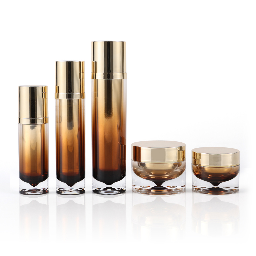
Most acrylic bottles on the shelf share the same rounded shoulders, the same smooth cap, the same forgettable silhouette. Once you've seen one, you've basically seen the entire aisle. That's exactly why blending in quietly erodes your brand's visibility. A bottle that looks like everyone else's doesn't get picked up, doesn't get photographed, and doesn't get remembered.
When your acrylic bottle has a distinct shape, an unexpected color, or a tactile finish that makes people want to hold it, you're no longer competing on price alone. You're giving customers a reason to choose you before they even read the label. Maybe it's a squared-off profile that fits better in a bag, or a frosted texture that catches light differently. These small departures from the norm signal that what's inside is worth noticing.
Customization doesn't have to mean expensive tooling or huge minimum orders. Even tweaking the cap design, adding a subtle embossed logo, or choosing a matte instead of a glossy finish can set your bottle apart. Think of your packaging as the first handshake with a potential buyer. If your bottle is just another generic container, that handshake feels limp. Give it a firm grip with a look that says, "This one is different."
Frosted, Tinted, or Crystal Finishes That Fit Your Vibe
Some people want a bottle that whispers, not shouts. Frosted glass does exactly that—it softens the light that passes through, turning a simple water bottle into something you want to keep on your desk instead of hiding in a cabinet. It also hides fingerprints better than clear glass, which matters when you're refilling it three times before noon.
Tinted finishes are a different kind of mood. A light amber tint can make even plain tap water look like it came from a mountain spring. Deeper hues—smoke gray, forest green, or ocean blue—give your bottle a bit of personality without needing stickers or custom engraving. And unlike painted exteriors, a good tint stays uniform through years of dishwashing.
If clarity is your thing, crystal finishes stay true to what's inside. You can see the bubbles rising in sparkling water, the color of your cold brew, or whether you actually drank half the bottle before your meeting. Some crystal finishes have a subtle texture on the bottom or around the neck, adding just enough grip so it doesn't slip out of your hand when condensation builds up. It's the kind of detail you don't notice until you hold a cheaper bottle and miss it.
The Psychology of a Bottle's Weight and Grip
Pick up an empty plastic bottle and your hand expects almost nothing. The fingers close without effort, the lift feels hollow, and the whole object seems to float away from your palm. Now reach for a glass bottle filled with cold liquid. There is a brief moment of adjustment—your hand tightens, your wrist braces, and your brain reads the heft as substance. That tiny pause is where the psychology lives. Weight is not just a physical property; it is a signal. A heavier bottle whispers permanence, quality, and care, while a flimsy one mutters convenience but also disposability. We rarely think about this consciously, but our hands have already made the judgment.
Grip works on a more intimate level. The curve of a neck, the texture of a label, the way a ridge catches the thumb—these details change how we perceive the liquid before a single drop touches our lips. A smooth, narrow neck demands a delicate pinch, which can make the drink feel refined or even fragile. A broad, dimpled grip encourages a full-hand hold, creating a sense of control and casualness. Producers know this. The bottle designed for a sports drink feels different from one designed for an expensive mineral water or a craft spirit. Each shape asks the body to hold it in a specific way, and that posture quietly shapes the mood of the moment.
What is interesting is how little verbal thought is involved. By the time we say “this feels nice” or “this feels cheap,” the decision has already been made in the joints and skin. A well-weighted bottle can make us pour more slowly, sip more attentively, and remember the experience more fondly. A badly balanced one makes us grip harder, settle faster, and discard sooner. So the next time a drink seems more refreshing than it should, look down at your hand. The bottle may be doing half the talking.
Caps, Pumps, and Closures as Mini Brand Ambassadors
A bottle’s cap, pump, or closure rarely gets the spotlight, yet it does more silent brand work than the label. The moment fingers graze a soft-touch finish or press a perfectly weighted pump, an impression forms. Smart brands treat these small parts as tactile signatures—embossing a monogram, matching a signature color, or shaping a closure to mimic the bottle’s silhouette.
The difference between a generic flip-top and a custom-designed closure is immediately felt. A heavy, frosted cap on a serum bottle whispers calm and clinical precision; a bright, glossy pump in a bold hue shouts playfulness. These choices are not random. They extend the brand’s visual language to the most used, most touched surface, reinforcing identity every time the product is opened.
Function carries meaning too. A pump that dispenses the exact dose without sputtering, a lid that snaps shut with a reassuring click, a cap that stays put in a travel bag—all of these signal competence. In daily use, those micro-moments accumulate, turning packaging hardware into a quiet but convincing ambassador for the brand.
Creating Collectible Appeal with Limited-Edition Designs
Limited editions work because they shrink the decision window. Instead of “maybe later,” the only real answer is yes or no before the stock runs dry. That urgency makes people pay attention to the small choices—an unreturning colorway, a numbered sleeve, a scrawled signature from the artist. The design stops being one of many and starts carrying a story about the moment it appeared.
Much of the pull comes from the buildup. A blurry crop on social media, a countdown in the corner of a story, a surprise preview for members—each beat gives fans something to react to before the drop even happens. Once it’s gone, the chatter shifts to trades and resale threads, where missing out becomes part of the item’s history. Owning one says you were paying attention when it mattered.
But scarcity without substance wears off fast. A limited run only stays desirable if the design feels like it earned the constraint: a motif that riffs on an older piece, a finishing method too slow for mass production, or a reference only the core audience would catch. When the limit lines up with a reason to care, the piece keeps its value well after the timer hits zero. Otherwise, it’s just urgency in a box.
FAQ
Try embedding small objects inside the bottle wall during molding—like sand, glitter, or even branded confetti that moves when the bottle is tilted. Another trick is to use UV-reactive pigment so the bottle changes color outdoors. For a tactile element, add a soft-touch matte coating on only half the bottle to create a split texture effect.
Focus on details that signal craftsmanship: hand-painted rims, engraved serial numbers, or a custom-mixed acrylic tint that isn't available in standard catalogs. Pair the bottle with a magnetic closure or a metal base plate. People pay for perceived care, so even a small run feels exclusive when every unit has a slight human touch.
UV digital printing tends to outperform vinyl stickers because the ink bonds directly to the acrylic and resists scratching. For high-volume orders, screen printing with a durable epoxy ink works well but limits you to simpler designs. If you need photo-realistic detail, go with UV digital and add a clear protective overcoat.
Yes—overcrowding the label area with too many fonts and logos is the fastest way to look generic. Avoid using thin, low-contrast text that disappears against liquid inside. Also, don't stretch artwork to wrap around the entire bottle if it distorts the central image. Leave at least 20% of the surface clear to let the product shine.
Stick to colors with low saturation and high lightfastness ratings, especially if bottles sit in window displays. Ask your supplier for a UV stability report on the tinted acrylic. If your brand color is neon or pastel, consider using a clear bottle with that color applied only as an internal coating—it reads as the same hue but lasts longer.
It works when the bottle's shape or texture becomes part of the daily ritual. A squared-off body that doesn't roll off a desk, or a lid that doubles as a measuring cup, creates a practical memory hook. The key is to tie the customization to a real behavior change, not just a printed logo.
You can source acrylic made with recycled content or use plant-based bio-acrylic alternatives. For decoration, switch to water-based inks and avoid metallic foils that prevent recycling. Another angle is to design a modular bottle where only the outer sleeve is replaced, so the core bottle gets reused instead of thrown away.
Use negative space aggressively—leave 60-70% of the bottle clear, then place a single small icon or wordmark near the base. Choose a matte finish over glossy for a softer look. If you want subtle branding, etch the logo into the acrylic instead of printing it, so it catches light only at certain angles.
Conclusion
A custom acrylic bottle becomes a quiet salesperson on the shelf when its silhouette breaks the mold. Instead of another straight cylinder, think of subtle curves, an asymmetric shoulder, or a base that catches light differently. Shoppers register these details before they even read a label. The goal is to make the form itself whisper something about your brand—playful, rigorous, minimalist. And while you're at it, resist the urge to copy the same frosted look everyone else uses. A soft tint, a high-polish crystal finish, or a gradient effect can shift the perceived value instantly. The material's transparency is a canvas, not a default. A bottle that looks like it belongs to no one else instantly earns a second glance.
Beyond looks, the feel in hand matters more than most brands admit. A slightly heavier base or a textured grip area changes how people interact with the product daily. Even the cap or pump becomes a tiny ambassador—choose a closure that doesn't just function but adds a tactile punctuation. Limited-edition colorways or engraved series numbers can turn a practical container into something worth keeping or gifting. These choices don't need to shout. A well-considered bottle that feels good, looks distinctive, and hints at rarity will outperform louder packaging every time.
Contact Us
Contact Person: Kara Yang
Email: [email protected]
Tel/WhatsApp: 8618857568397
Website: https://www.haitongplastic.com/